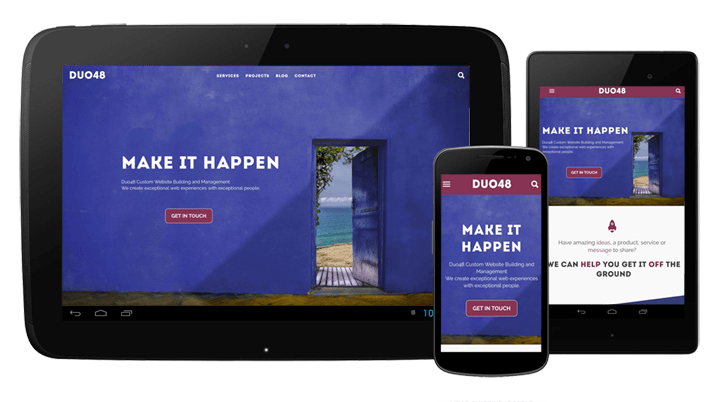
Responsive Design A.K.A. Responsive Web Design (RWD) is the current approach to website design ensuring visitors have a good viewing experience with whatever type of device they are using. It ensures that the website looks and functions as well on mobiles and tablets as on laptops and desktops. In practice it consists of a mix of flexible layouts, images and use of Cascading Style Sheet (CSS) media queries.
As the visitor switches from their laptop to iPhone, the website will automatically resize or move content to accommodate for resolution, orientation and available image size, ensuring it looks good on any screen.
In short, RWD adapts to meet the needs of the user, same site, same links and content displayed correctly on every device.
Why the need for Responsive Design?
For more than a decade mobile device ownership has grown exponentially whilst desktop & laptop sales have slowed. Trending technology has made surfing via small devices not only possible but with the right design on participating websites the proffered choice (see Internet Trends 2018).
Whilst on your mobile device have you ever been on a site that looked awful, took too long to load, had poor navigation or you couldn’t get a link to work no matter how hard you pounded on your screen…
Those are all signs of a non responsive or badly designed site. We can help you to avoid those pitfalls.
Does Responsive Design help with SEO?
Yes! Google has been prioritising mobile-friendly sites in its search results algorithm since April 2015 (see What Is Mobilegeddon?).
It’s now essential that your site is optimised for mobile by using responsive design if you would like/need to appear in Googles search results.
Can you afford NOT to employ Responsive Design?
Not really. In recognition of the increasing use and number of mobile devices around the world and Google taking into account if a site is mobile friendly or not when searches are made from a mobile device. Simply put, this means if someone uses a mobile phone or tablet to search and your website is not mobile friendly, the site will be ranked far lower because of this.
In Conclusion
Whether or not to have your site mobile optimised is no longer a valid question. You can’t afford not to have a responsive website.
If you have any questions regarding Responsive Design or any other topic we may help you with, please do get in touch, we’d love to hear from you.
Further Reading
- Internet Trends 2018 (vpnmentor.com)
- Mobile Statistics 2017 (smartinsights.com)
- What Is Mobilegeddon? (searchengineland.com)


